
Guide Tainan is a mobile app and web page that is designed to provide a valuable resource for the community, making it easy to access information about events, news, and articles that are relevant to their needs.
Provide a convenient and accessible mobile app and web page for the community to access diverse range of events.
To begin, we developed a persona to more accurately reflect the users who would benefit from the service.

Using this persona, we formulated a problem statement that addresses their specific needs.
Helda is an office worker who needs a reference on where to go and stay update on what's happening within the community, because she has just stayed in the city for a year and not much been explored.
To better understand the market and competition, we conducted a competitive audit. We selected three major competitors that represent some of the most popular sources for people to get updates on events and activities in the area.

To conclude our analysis, we developed a user journey map based on our persona and the findings from the competitive audit. The journey map includes task list, feeling adjective, and improvement opportunities of each action in this journey.

For this project, our focus has been on designing a mobile interface. In today's fast-paced world, people are constantly on the go and rely heavily on their mobile devices to stay connected and informed. By creating a mobile-friendly interface for our tool, we can offer an accessible and convenient way for community members to stay up-to-date on the latest events and happenings in the city.
We began by creating wireframes on paper, which I believe is a quicker and more efficient approach. In addition, we also created a site map that includes all the necessary pages as a point of reference for the project with a user flow as a reference


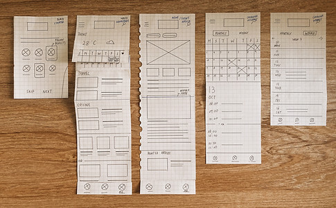
From this sketches, digital wireframes for mobile app and mobile web were developed on Adobe XD.


The sticker sheet contains various design assets such as the logo, color palette, typography, and some of the main UI components, which are shared throughout the project. We would like to share our thoughts on the logo and color choices, as they are integral to our branding strategy.
We designed the logo with a minimalist typographic concept, recognizing the power of typography in conveying information effectively with just a few words. For the color scheme, we chose red, yellow, black, and grey, which convey a sense of happiness and energy. It's worth noting that these colors are also used in the Tainan government logo, helping to tie our branding to the local identity and foster a sense of community.


Participants were provided link to prototype with questions and tasks listed in a word file. After completed the usability study, participants were asked to send back the file with feedbacks filled. Below are the questions and tasks:
Prompt 1: Starting on the homepage
Q: How do you feel about the homepage’s proportion?
Prompt 2: Check on an event through the calendar
Q: How easy is the task? Is there anything you would like to change or add on the page?
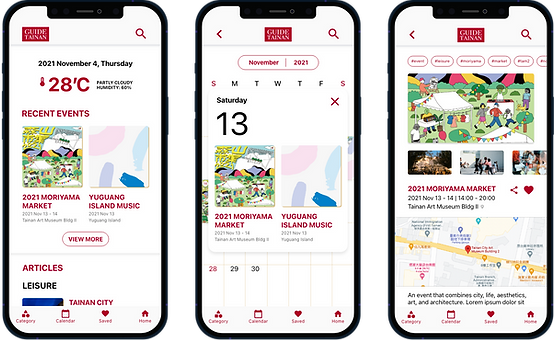
Prompt 3: Check on the 2021 Moriyama Market’s event information
Q: How easy is the task? Is there anything you would like to change or add on the page?
Prompt 4: Click on the category and select education
Q: How easy or difficult was this task to complete? Is there anything you would change about the process?
Prompt 5: Check on the first article
Q: How easy is the task? s there anything you would like to change or add on the page?
Prompt 6: Go back to homepage
1. I think that the mobile app is useful
2. I felt very confident using the website
3. I found the mobile app unnecessarily complex
4. I thought the mobile was easy to use
5. I think that I would need the support of a technical person to be able to use this mobile
6. I thought there was too much inconsistency in this mobile app
Which number do you agree with:
Which number do you disagree with:
Any suggestions and advices? Please share it below, your comments will be highly appreciated. (Optional)
Following the finding 1, some of the elements were cropped and did revision as shown in the “after usability study”.

Following the finding 3, users experienced a problem while tap on the date calendar, therefore, the calendar has been resized large.

Here is the mobile app and mobile web design for Guide Tainan:


If you're interested, feel free to have a look at the landing page here:
Guide Tainan - Mobile App Prototype
Guide Tainan - Mobile Web Prototype
During my Google UX Design course, I had the opportunity to work on this project and learned about the importance of considering the phone screen look when designing for mobile devices. I also learned to closely observe the functionalities of common browser apps such as Safari and Chrome, including the back and forward buttons and the space left after the link bar. By recognizing and addressing these issues, help to remind on designing UI elements that are not only visually appealing but also functional and user-friendly.